


My role: UX and UI designer
Enhance navigation and usability throughout the homepage and service pages to make it more user-friendly for efficient content discovery and navigation. Increase visibility and traffic for the latest content additions on the website.
the problem
Because the website was originally made using the CMS platform, we faced some limitations. So, we went back to the content and existing sitemaps, adapting them to meet updated needs. We looked for better ways to label and guide users to new content in various categories. Our main goal was to improve the user experience, making it easier for people to find and interact with the content they're looking for. We couldn't make significant changes to the website structure, so we had to find solutions within those constraints.
the challenge
Open Health’s platform user research and information analysis.
Competitor’s analysis, user flows, ideation, wireframes, wireframes prototype and usability testing before starting the designs.
my contribution
Open Health Platform analysis and information architecture
The initial phase involves analysing the existing data, particularly from Google Analytics, to understand the rationale behind the necessary changes. My colleague and I meticulously examined every page and section of the website, annotating notes, posing questions, and suggesting improvements. This collaborative approach helps in comprehending the pain points and crafting solutions for the website. Using the FigJam board proves to be an efficient tool for facilitating such collaborative sessions, especially in the context of remote work.

Competitive analysis
Investigating the market research is a very important step. This helps in forming an idea and understanding how other sites successfully handle large volumes of content, paying attention to clarifications, naming conventions, and navigation structures.
My colleague and I strategically divided the market competitors for analysis. We conducted thorough research on websites that host a substantial amount of content on their platforms. Utilising sticky notes, we annotated comments, highlighted positives and negatives, and identified patterns that have proven effective on websites with extensive content.
Key questions guided our analysis: How might we? How user-friendly is the navigation through the content? What strategies do users employ to continue reading and discover related or interesting subjects?

Key Takeaways
Addressing these issues is crucial for enhancing the overall user experience and ensuring that visitors can easily navigate, find information, and engage with the content on the site:
Unclear Main Navigation: The main navigation lacks clear labelling, which may result in user confusion and difficulty in finding specific sections or information.
Content Hierarchy Issues: The content hierarchy is unclear and appears to be competing with itself. This can lead to a disorganised and confusing user experience.
Lack of Site-Wide Search Functionality: Without a site-wide search feature, users may face challenges in quickly locating specific content or information.
Poorly Laid Out Content Pages: Content pages suffer from a poorly laid-out navigation structure. The absence of essential elements like back buttons or breadcrumbs leaves users stranded on a page with no apparent means of navigating back or exploring related content.
Limited Visibility of Latest and Related Content: Users lack a clear way to access the latest content or explore related articles across the website, potentially hindering their ability to discover relevant information.
Creating a competitive feature comparison Matrix helps filter through all the sticky notes to understand what are the behaviour patterns and the optimal ways for the user to navigate through the website's content seamlessly.
This comprehensive analysis lays the groundwork for informed decisions on how to enhance the presentation of heavy content, making it easily accessible and navigable for users.

Sitemap
Site maps and flow diagrams are invaluable tools for breaking down the user journey into distinct steps. By visually mapping out each stage, these diagrams provide a clear representation of the user experience, allowing for a detailed examination of the entire process. This visual approach helps in identifying potential issues, or points of friction in the user journey.
Considering and keeping in mind the limitations and how many changes we can make across the website’s navigation we have updated and simplified the site map to show a clearer path for the user. We added breadcrumbs, related content and back buttons that help the user to find their way across the pages.

Before

After
Wireframes and Prototypes
Including the findings from research, I have started with sketching some ideas on wireframes. Throughout this phase, I carefully considered the existing page layouts and took into account the constraints posed by the Craft CMS.
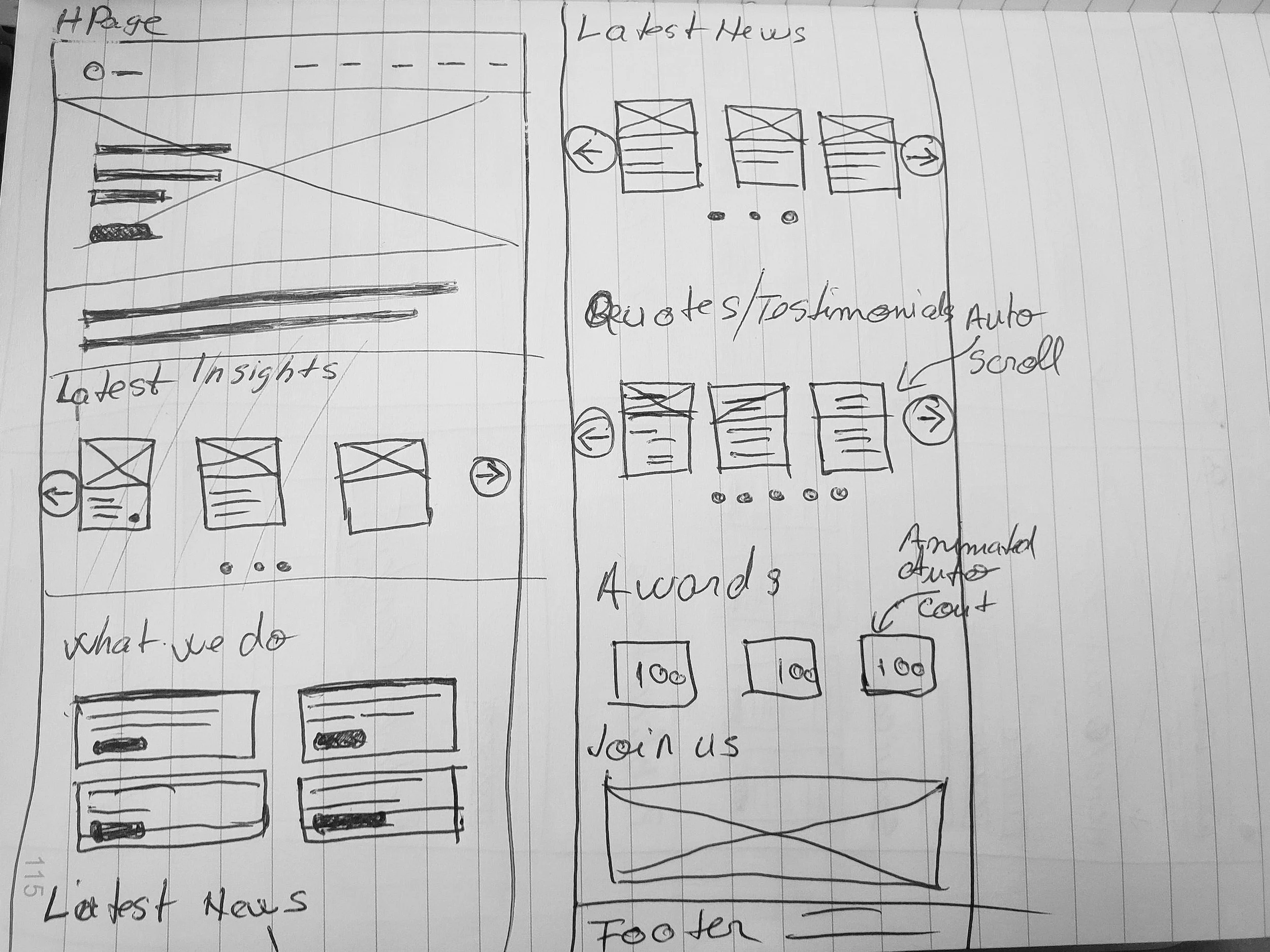
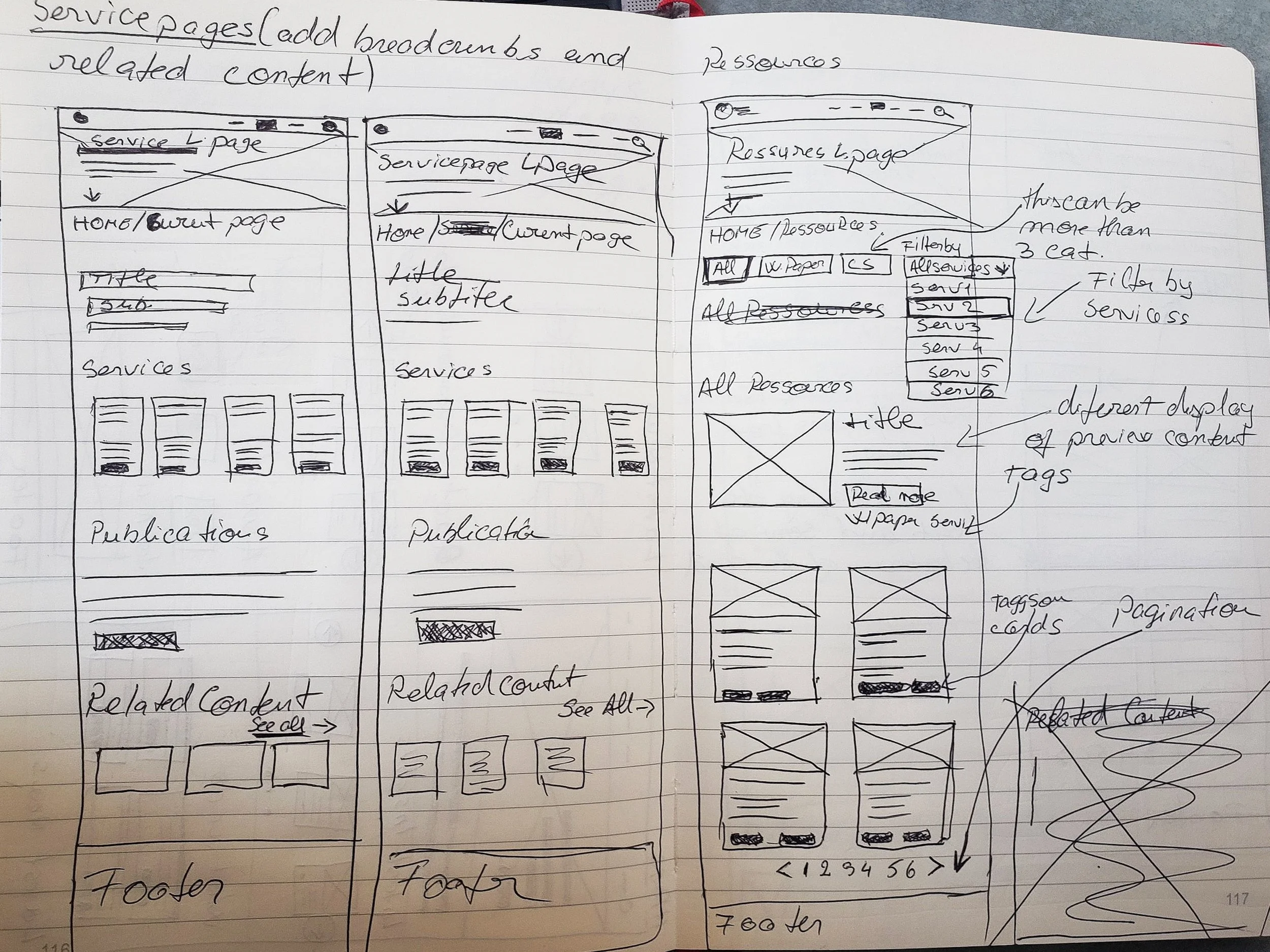
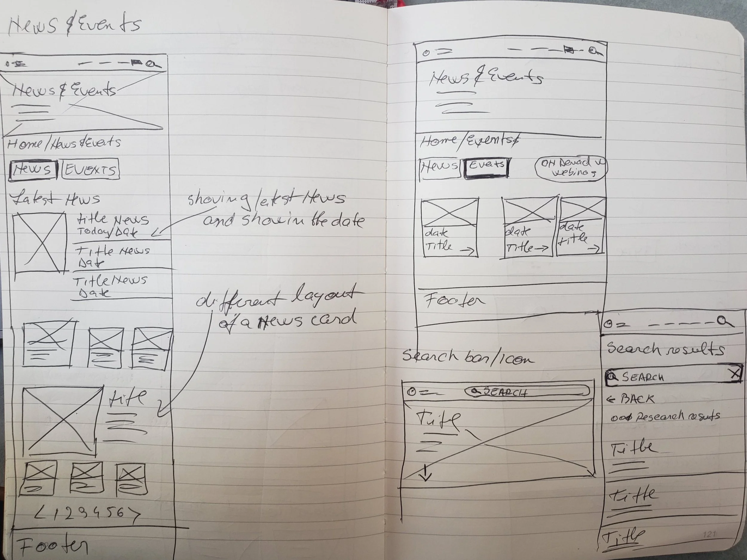

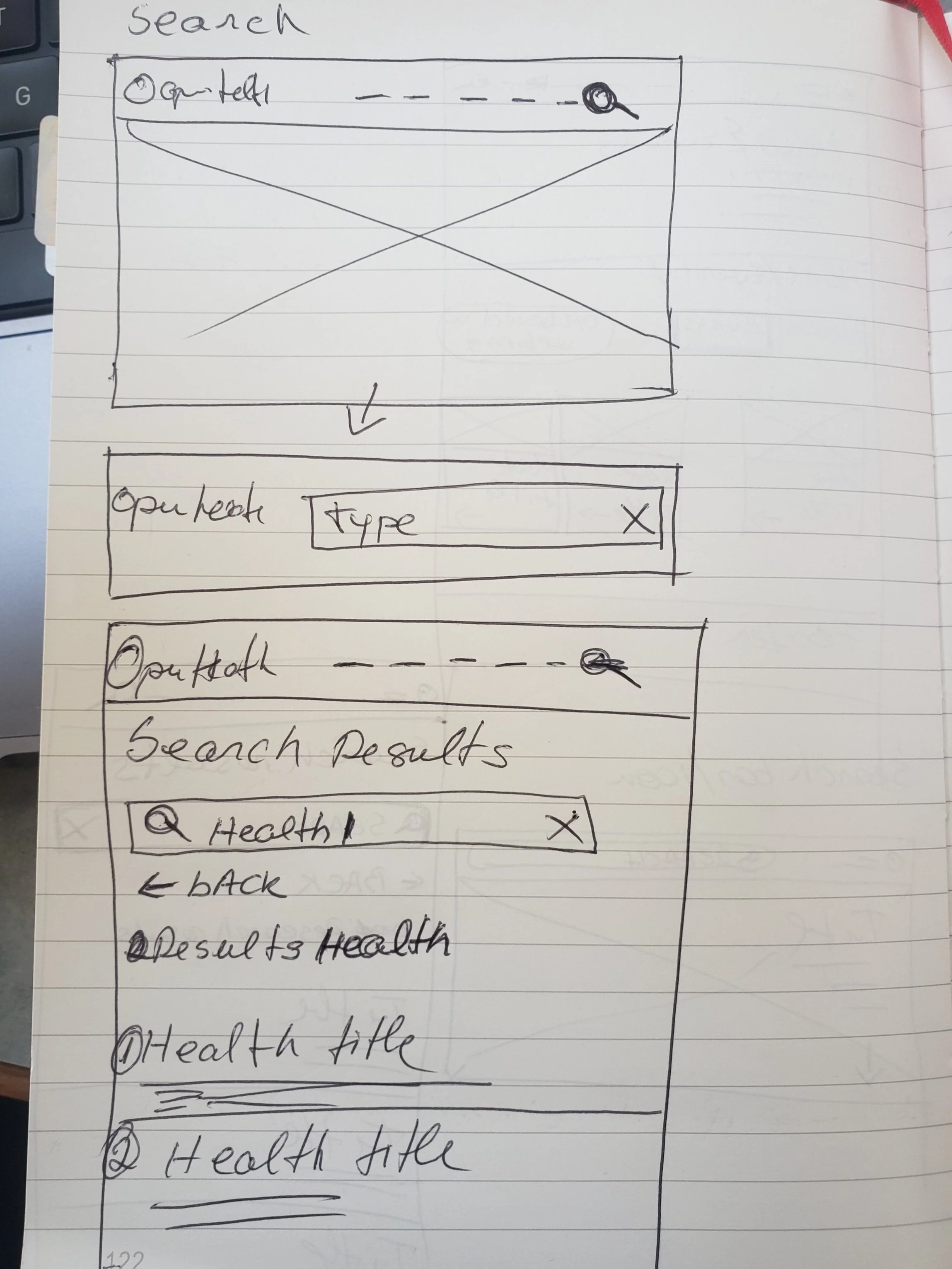
After my colleague and I thoroughly checked and reviewed the sketch wireframes, I proceeded to create the high-fidelity version and prototype.
This phase is vital in testing the navigation and ensuring that none of the goals or pain points weren’t overlooked. The high-fidelity version allows for a more realistic representation of the final product, and the prototyping enables us to simulate user interactions, providing valuable insights into the effectiveness of the proposed solutions. This iterative process is crucial for refining the user experience and ensuring the designs align seamlessly with the identified goals and address the pain points identified earlier.


Designs
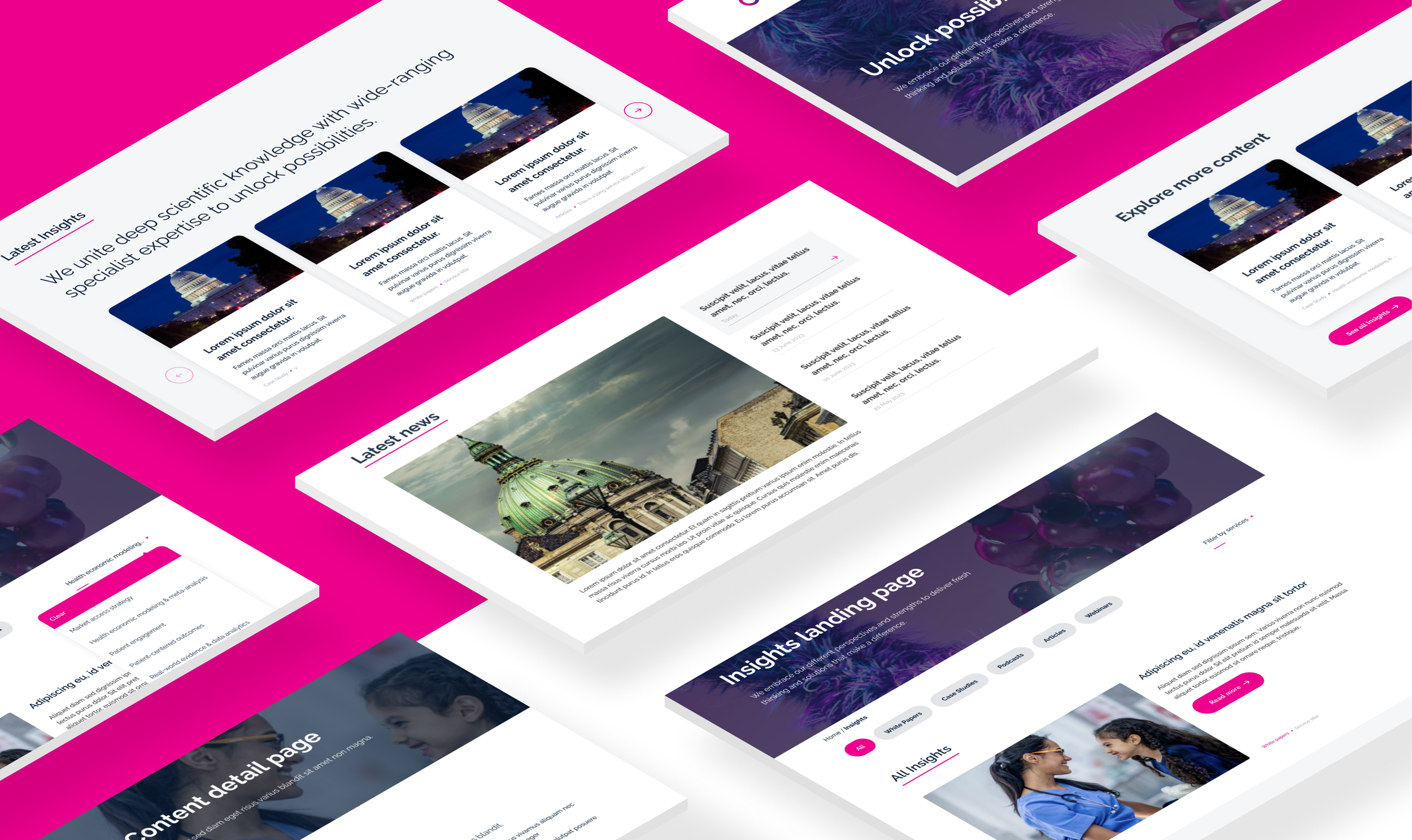
Using the existing brand guidelines and components from the design system, I ensured consistency throughout the website. Following the development of all components and pages within the Craft CMS, the next step involved the meticulous process of recreating and integrating these new components into the live pages. This not only maintains the established brand identity but also guarantees a seamless transition from design to the live environment.
Lesson learned
Taking into consideration the user needs is crucial for crafting both short-term and long-term solutions. While some quick fixes may address immediate issues, a strategic perspective that accounts for the long-term sustainability of solutions is important.
Collaborating closely with developers who have a deep understanding of the platform is indeed invaluable. Their insights can significantly impact the project's trajectory and contribute to achieving a more refined and effective final result.
In the research phase, asking questions about any section, path, or area that may not make sense demonstrates a thorough and meticulous approach. This curiosity and attention to detail during research help uncover potential pain points and pave the way for more informed and user-centric decision-making throughout the project.